Lumi Linna Castle Rebrand ·
Lumi Linna Castle Rebrand ·
Lumi Linna Castle Rebrand ·
Lumi Linna Castle Rebrand ·
Lumi Linna Castle Rebrand ·
Lumi Linna Castle Rebrand ·
Purpose
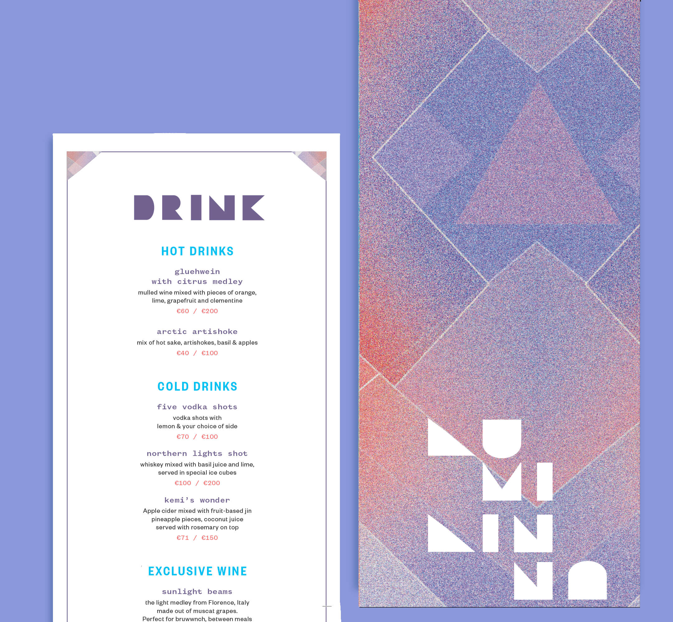
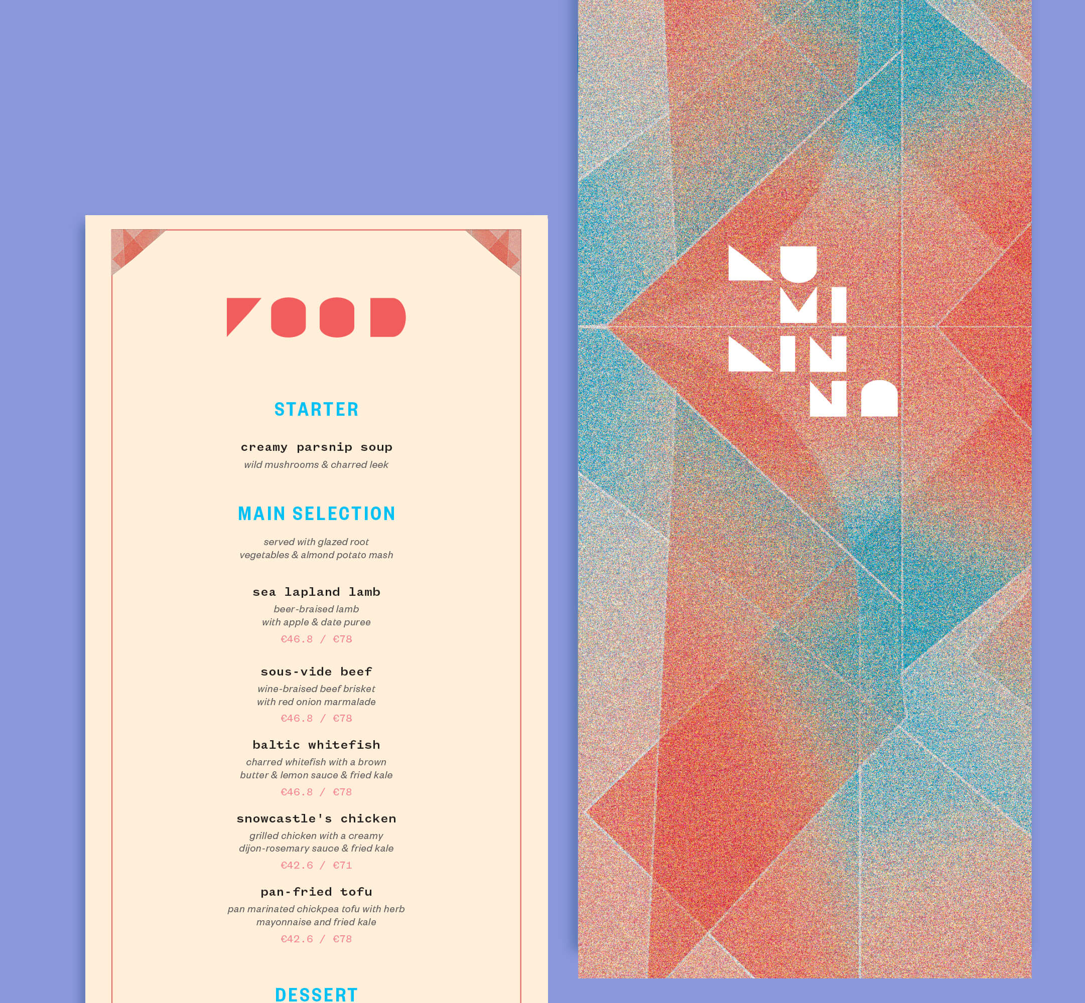
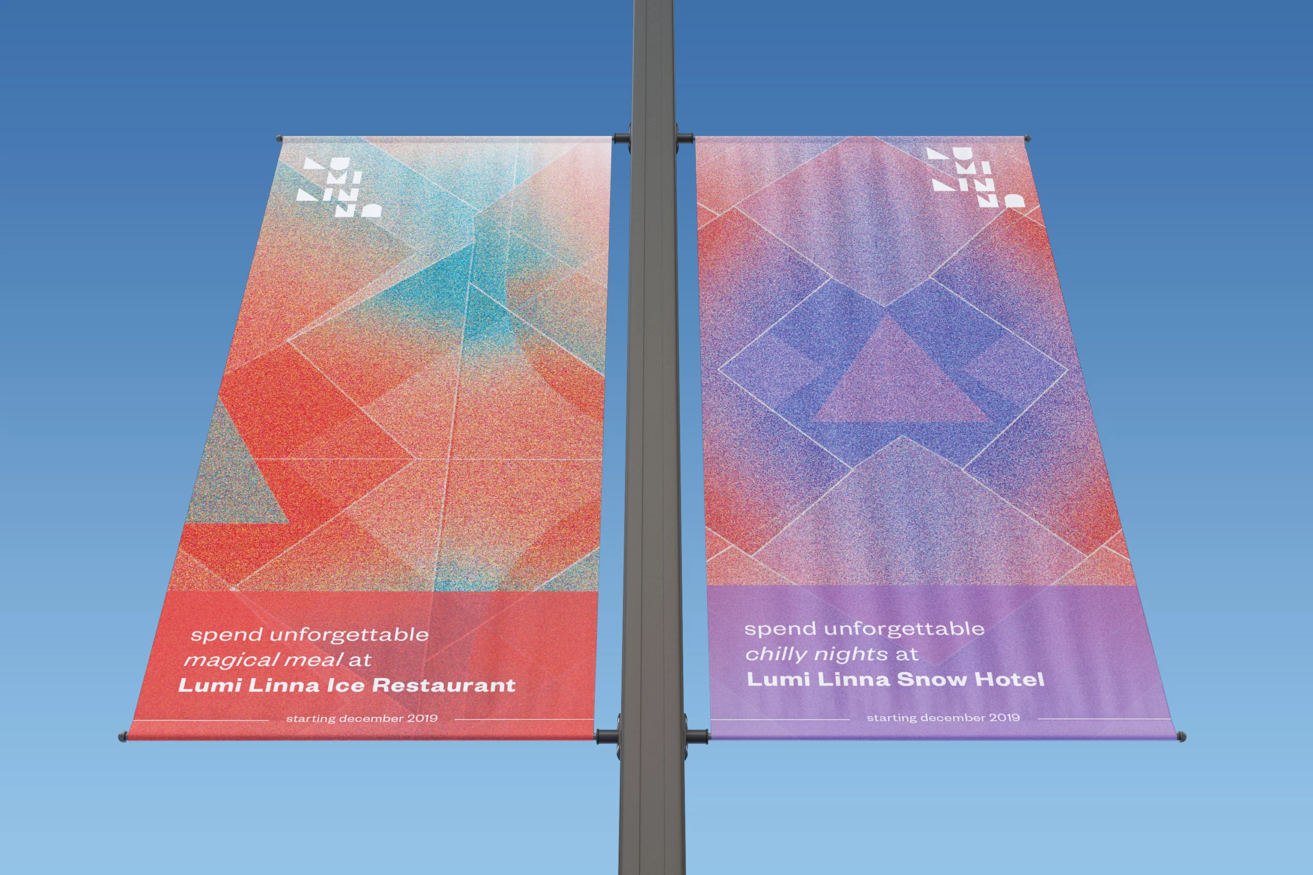
Lumi Linna is the Finnish Snow Castle, a popular destination for tourists. While the interior is breathtaking, the current branding of the castle is outdated. Compared to its competitors, the logo and the printing materials do not make it attractive for the young audience and the prices are high. The goal was to make the new logo, that could be chiseled on ice, a new identity that would display the winter magic and apply it to the menu of the restaurant.
Approach
At first, I did research into their competitors and the restaurant itself. There are numerous Ice Bars around the world, including one in NYC, but the main attraction of this castle is how seasonal it is. Lumi Linna is built from scratch every December and closes down in March, making it an exclusive winter landmark. Such as the name suggests, it is actually built out of ice, so during the planning stage main focus was on geometrics and “see-through” materials.
Moodboard
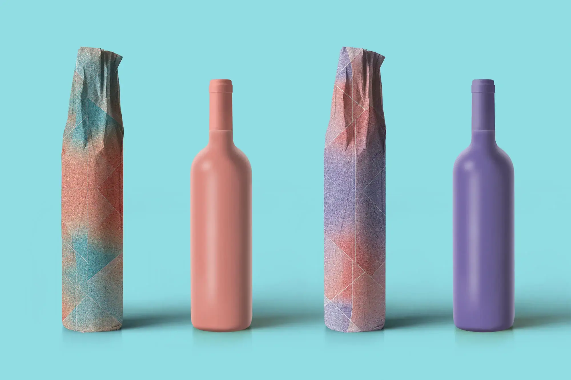
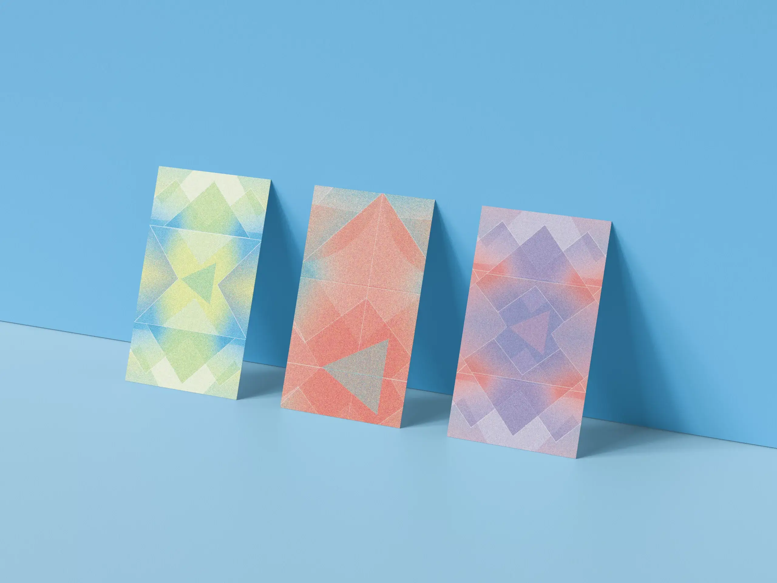
There were 3 mood boards in total. At first, the project was based on “Sunrise Beams on Ice” – gradient driven colors which later influenced the brand colors + patterns. The “Nordic Lights” was made to bring the magical properties of the Northern Lights. In the process of creating the logo I came back to brainstorming and developed the “Geometry of Winter” – featuring simple shapes and winter spirit, which helped to create the brand patterns out of the letters in the logo.
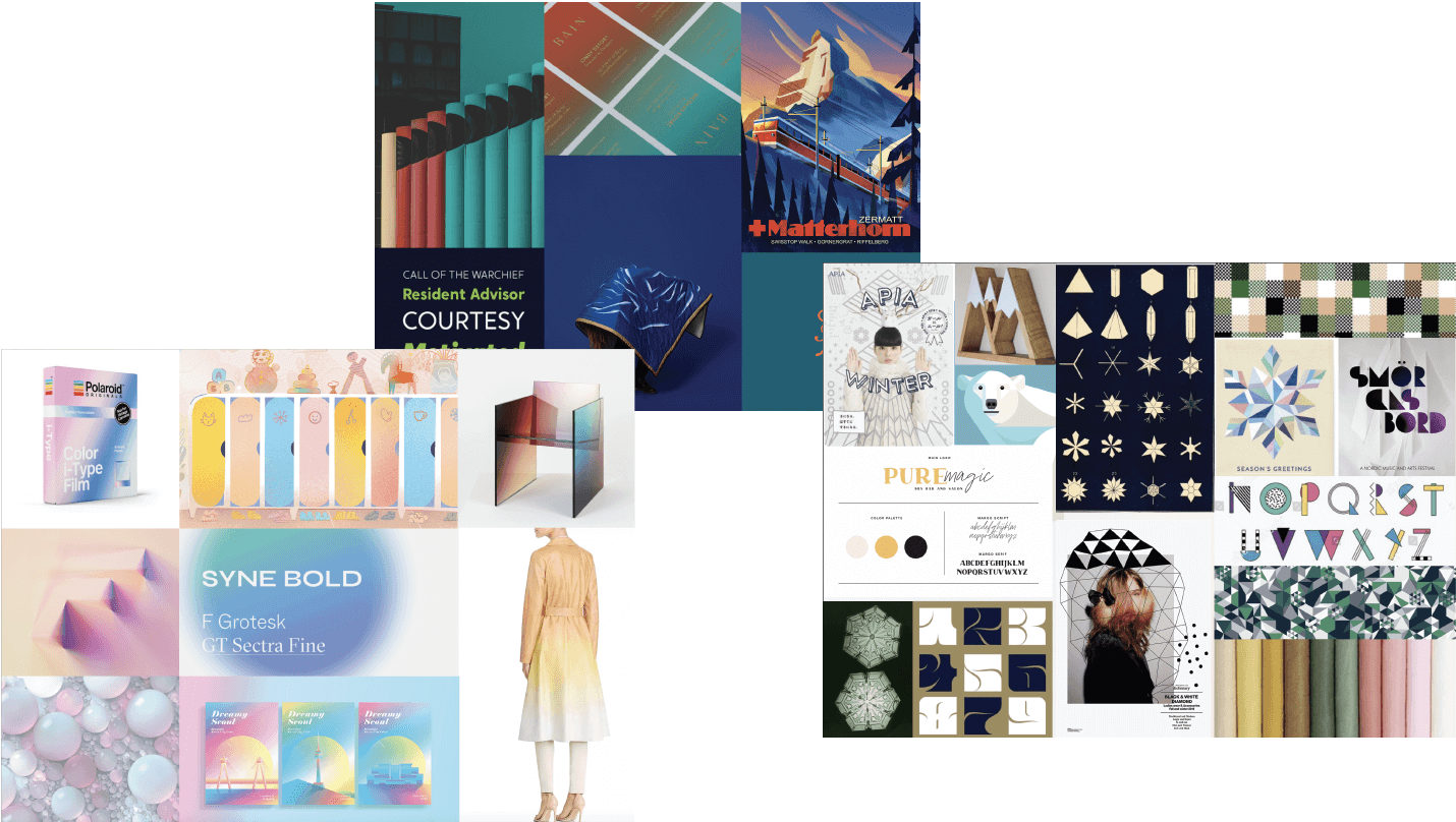
Geometry of Winter – was important for the logo + pattern creation
Nordic Lights – sophisticated mood inspired by Northern lights
Sunrise Beams on Ice – gradient-inspired by looking at the reflections of sun on snow
Logo
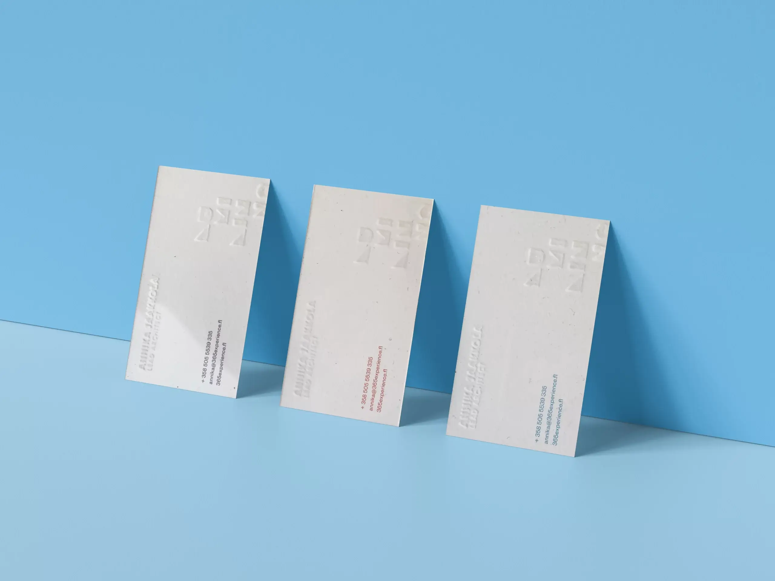
Since the main focus was on whether the logo can be chiseled on ice, it was important to drive on geometricity and simple forms. The initial logo was depicting the “castle” and “Disney-ish” vibe but did not correlate with the expensive prices of the menu. The final logo comes in two iterations – horizontal and vertical. Vertical is used in menus and large promotional materials, while horizontal is for business cards and stationery.
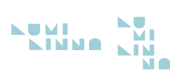
Main Logo
Alternative – Present on the menus
Established Visual Systems
#da5a5b
Pantone 556-U
#42b4e5
Pantone 115-6U
#78687f
Pantone 98-12 U