
Typeface Specimen Book ·
Typeface Specimen Book ·
Typeface Specimen Book ·
Typeface Specimen Book ·
Typeface Specimen Book ·
Typeface Specimen Book ·
Purpose
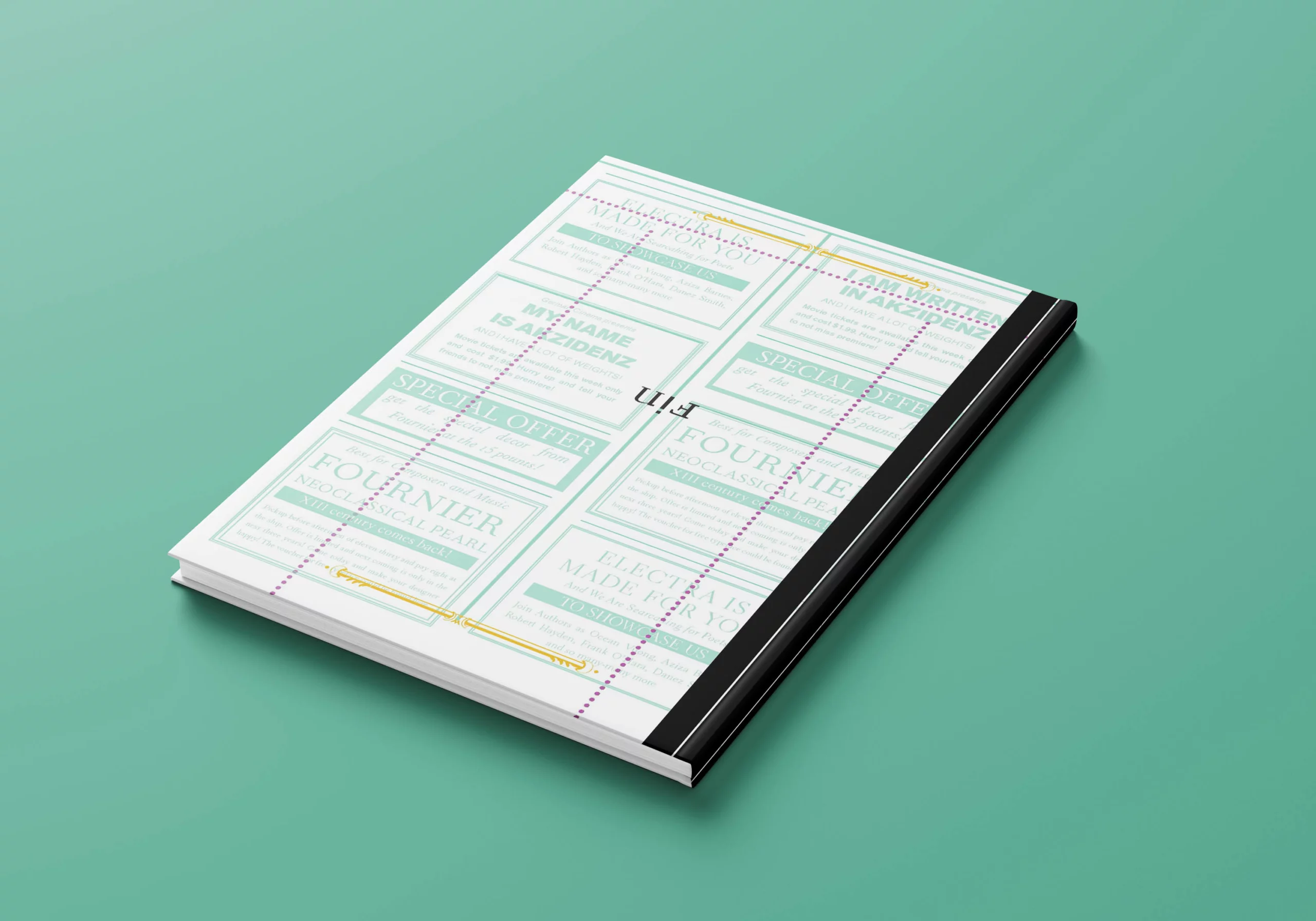
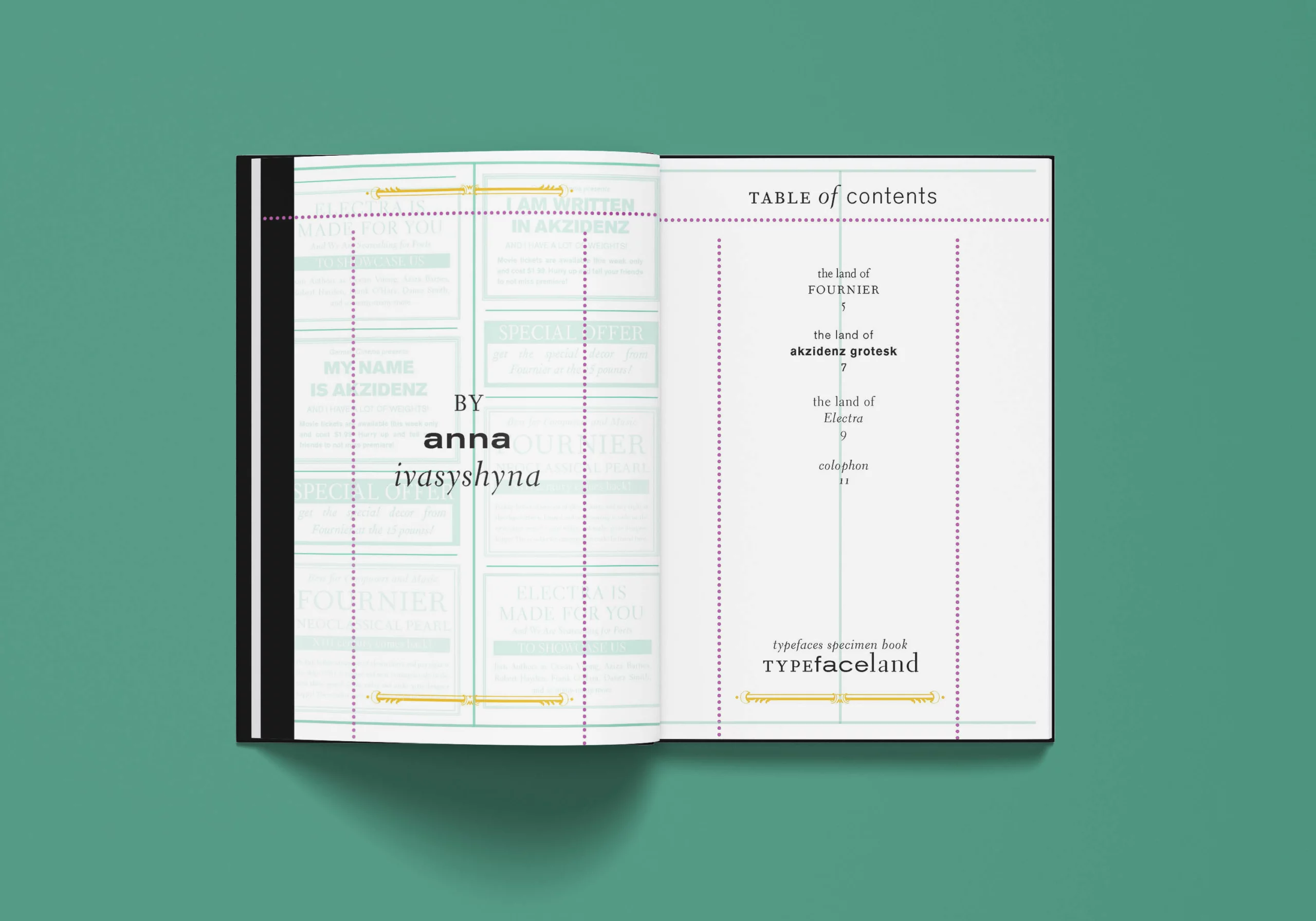
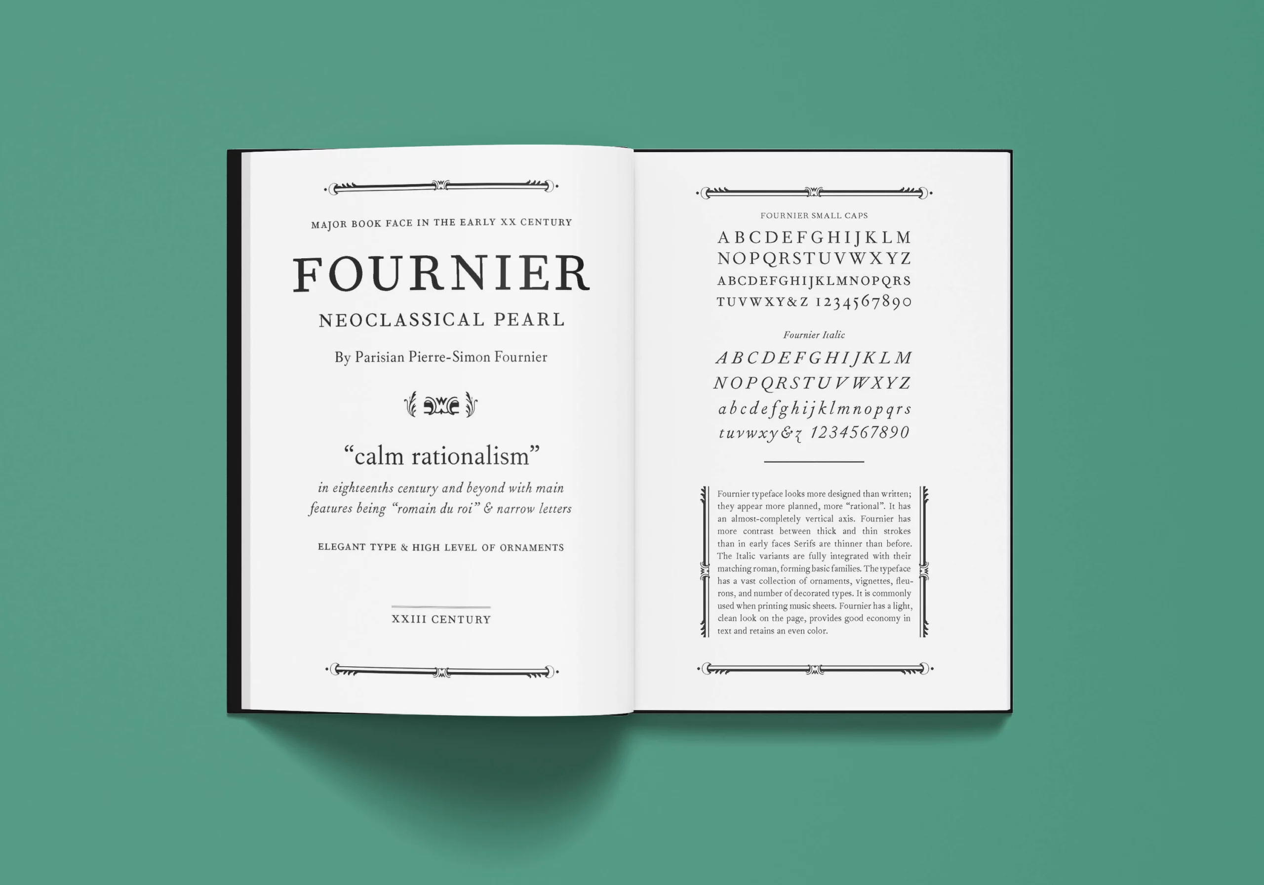
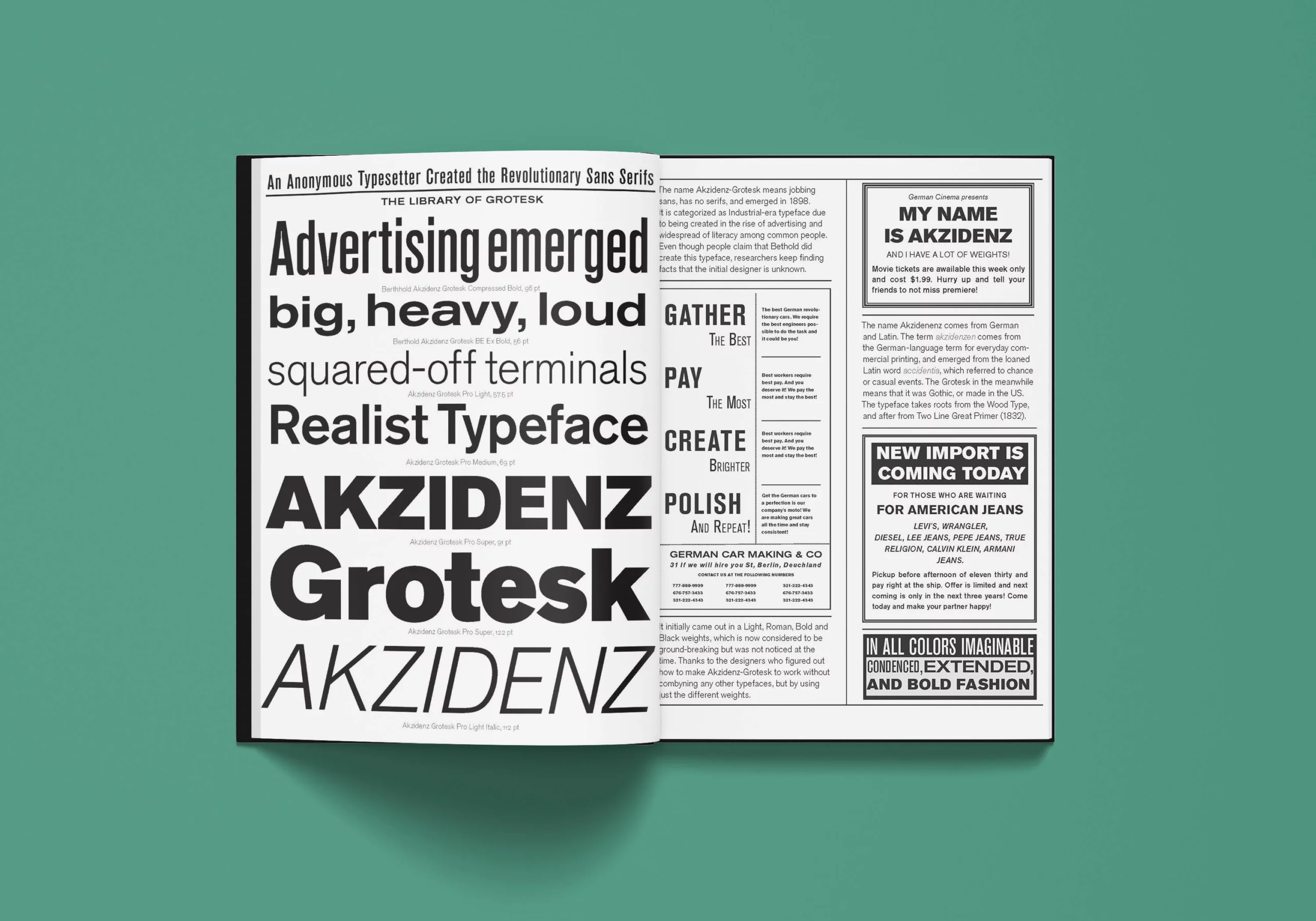
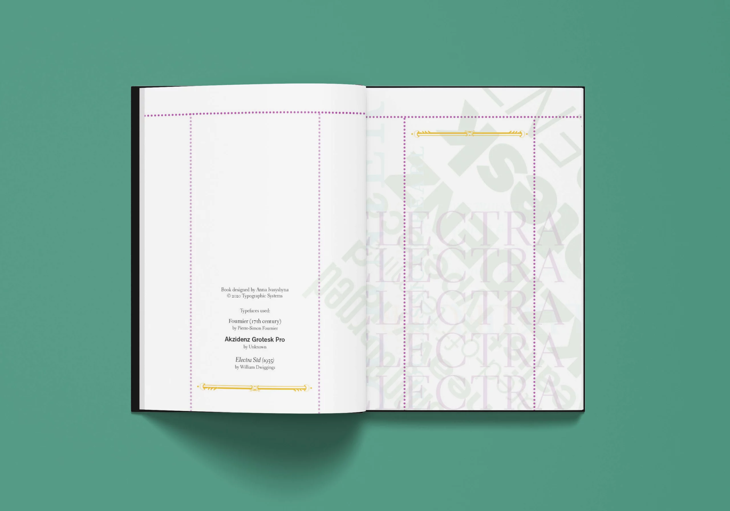
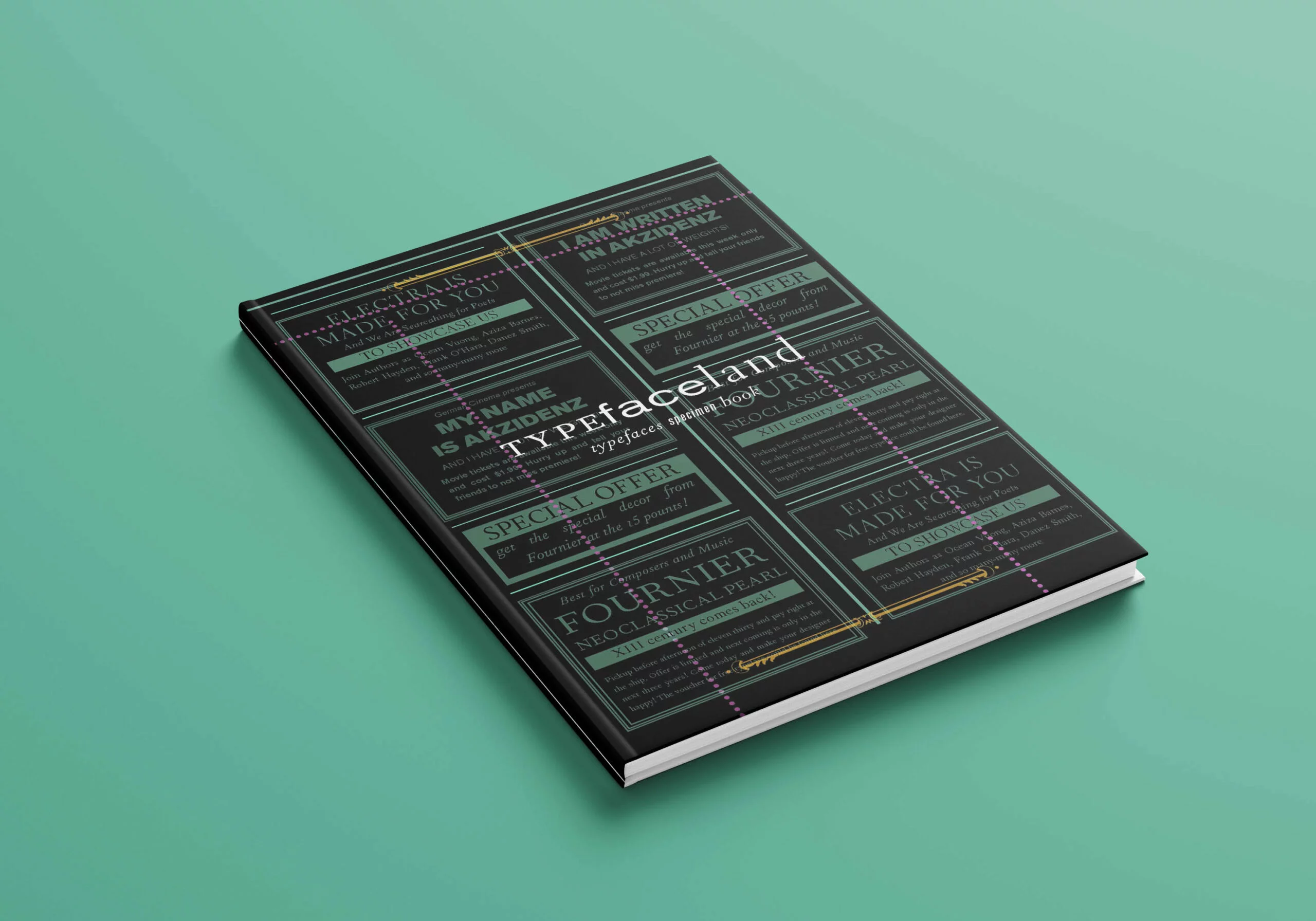
The project’s main focus was on connotative value, to create three different spreads showcasing typefaces of choice. The only rule is to keep at least the selection a period away to create room for contrast. The final product is the specimen book of 7.5 x 10 with cover, title, and colophon pages in CMYK while keeping the period pages in b/w. The CMYK pages had to link the different historical spreads together in a cohesive book.
Selection of Typefaces
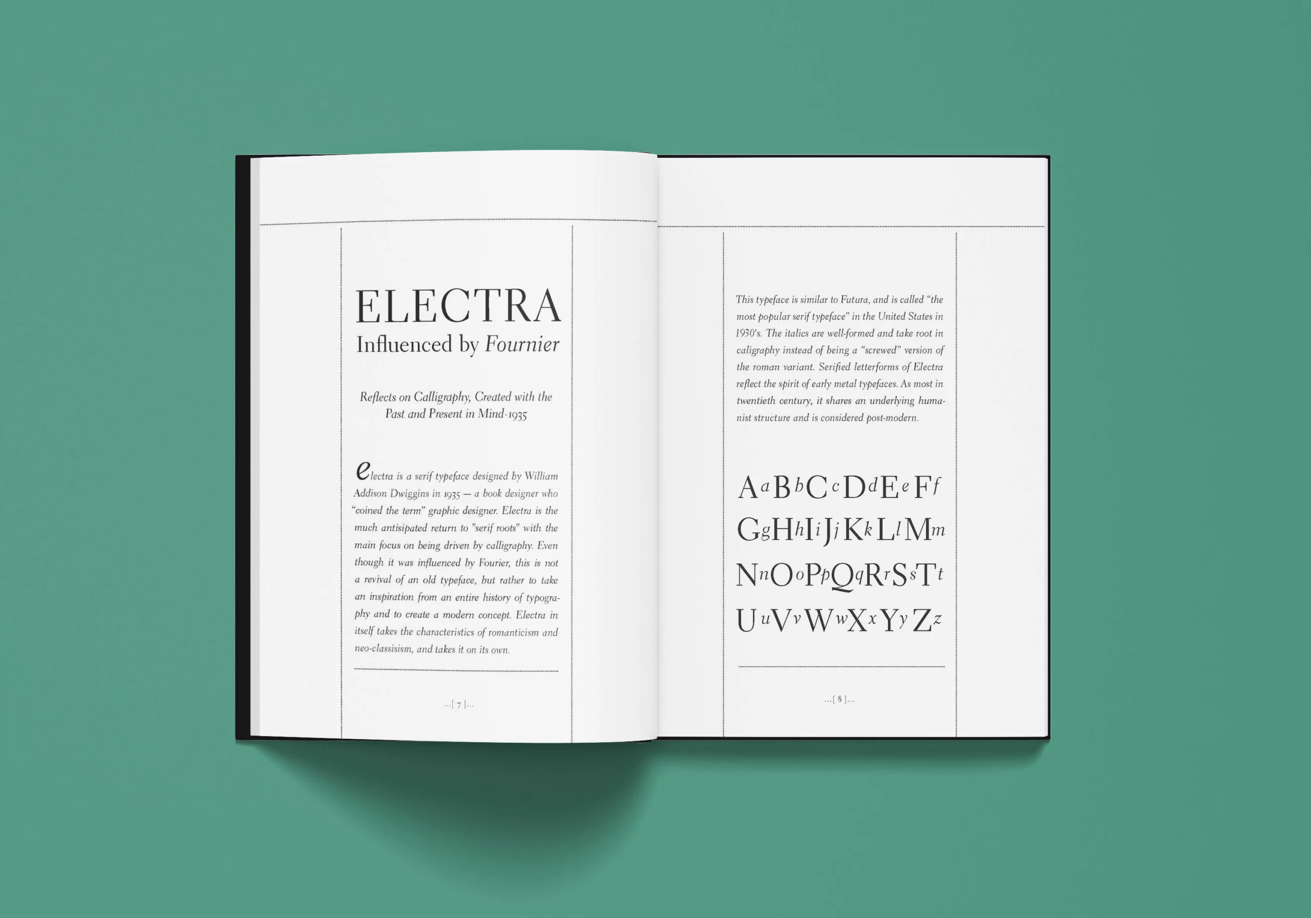
I selected Akzidenz Grotesk since I wanted to explore the graphical style of the 19th century, and is well-known for a large number of variants of different weights. The second typeface is Fournier, which is known for being used in music scores and for the decorative borders embedded inside of the typeface. The third typeface is Electra, which is directly influenced by Fournier and inspired by literature.
Moodboard
After the song selection, I started brainstorming the color palette and visuals based on my own perception and music video. Read more about the references by moving the mouse over the X’s. The lyrics have “loud whisper”, and in order to emphasize it, I used white type, which draws the eye of the viewer.
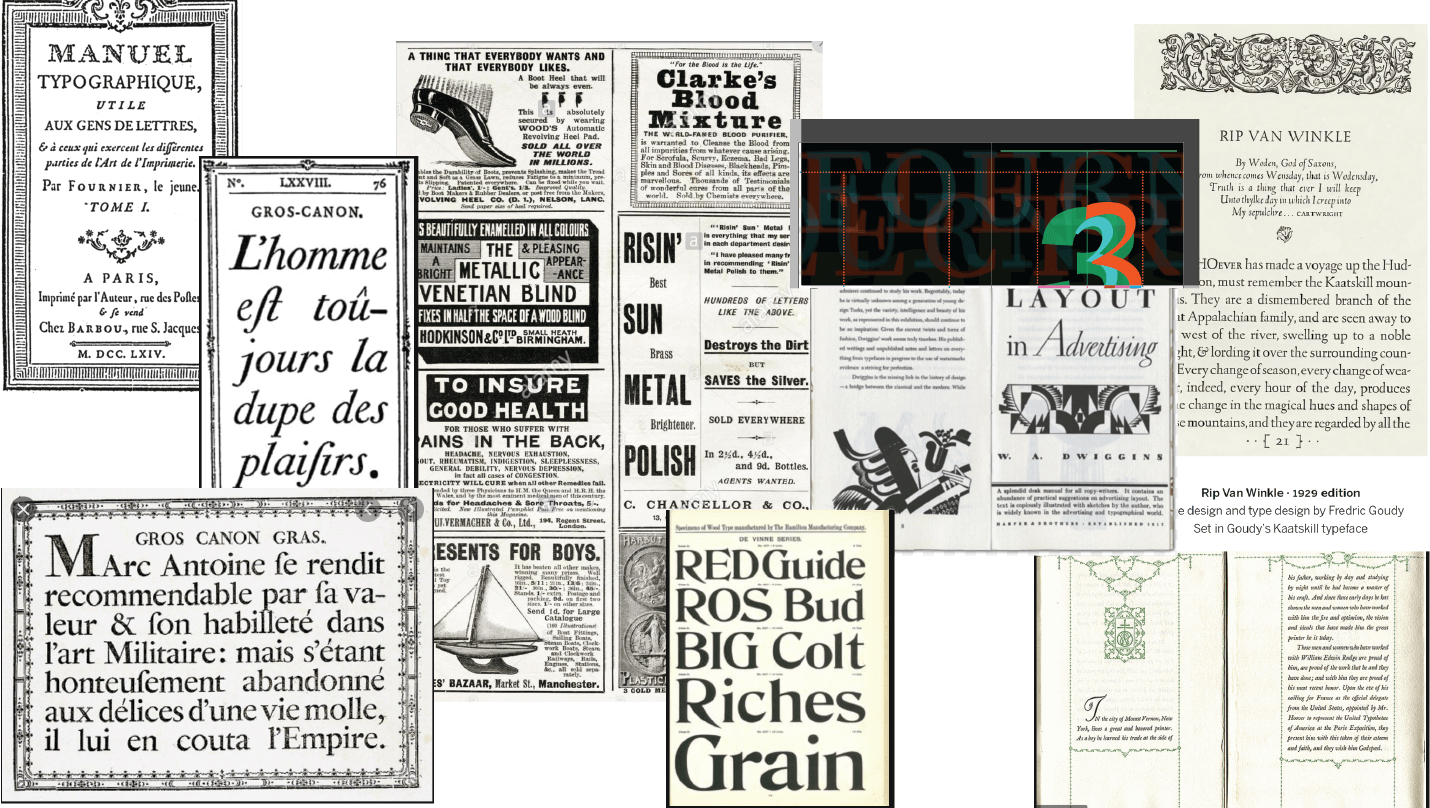
Fournier – refference for the stylistic treatment of the title page (left page of Fournier spread)
Typefaces
& Colors
#010101
#eec356
#629584
#9d5687